9 Tips That Can Drastically Improve Your Website's User Experience
n today’s changing marketing landscape, your website has become a more powerful tool than ever. As a 24/7 salesman, your website has the potential to be your most powerful asset and the centerpiece of your marketing efforts.
However, rapidly changing technology can make your website feel old and outdated. While sometimes a redesign might be ideal, you may not know what are the main things you should looking for in your website. Therefore we have put together a list of 10 simple ways you can improve your website to make it more helpful and useful.
1) Use White Space
On more than one occasion I have heard clients complain that there was too much white space on their site and that this unused real estate ought to be used for advertising more of their services. However, white space is essential to good design. White space makes your content more legible while also enabling the user to focus on the elements surrounding the text.
In Asrar we recommand white space around text and titles because we believe that it increases user attention by 20%. White space can also make your website feel open, fresh and modern and if your branding is consistent with these then it can help you communicate that feeling to the user. One downside of white space to keep in mind, however, is that it does indeed take up space.
If you’re trying to get a lot of content above the fold (above the part that is immediately visible without scrolling) having too much white space might be replacing some valuable information. The key is to find the balance between what is most important to communicate at the top and surround that with some space to highlight the image and/or text.
2) Page Speed
One of the most frustrating experiences for users of the web is waiting for a page to load for too long. With the rise of the mobile devices, people are accessing content all over the world on many different platforms. While browsing online at Starbucks or while watching TV on their laptop, they expect a fast result for the content that they want.
When they don’t get it, they usually bounce. Slow page load is an interrupting experience for the user and it can be a source of frustration and often users simply don’t have the time to wait.
3) Use Attractive Calls to Action
Your customers are already accustomed to following visual cues to determine which content is important to them. Calls to actions that are clearly marked with an action word enable your user to more easily navigate your site and get to where they want.
In creating buttons for your website you should think about color and the psychology of color.Different colors evoke different messages. Think about the message that you want to evoke for a user (trust, experience, intelligence) and choose your colors wisely.
A second thing to consider is the actual words you use for your buttons. The words should include a verb or an action word that excite the user to do SOMETHING. Choosing the right words or psychological triggers is highly determined by the level of emotional identification that word prompts. No emotional connection means no action. So make your words bold, time sensitive and action-oriented.
4) Use Hyperlink Differentiation
When you add a link to any page you are saying you want the user to click there. Make sure links are easily identifiable by visual cues. Underlined text and different colored text, draws the attention of the reader and lets him know that this is a link.
A simple way to test how effective your links are is to blur and remove the color from the design and see what stands out.
When hyperlinking, also stop to think about the length of the hyperlink. The longer the link titles the more easy to identify they are.
5) Use Bullets, Bullets, Bullets
Bullets will enable the user to quickly get all the information they want: benefits, ways you solve their problem, and key features of a product/service-- all in a short amount of time. This will make your propositions more attractive and will enable the user to get all the information they need. Additionally you do not have to go the traditional route with a simple circle.
With tons of cool icons out there you can also get creative with your bullet and help the reader further with images that represent your point. This is also useful because it will force you to isolate the most important points you are trying to make without getting caught up in terminology or specifics.
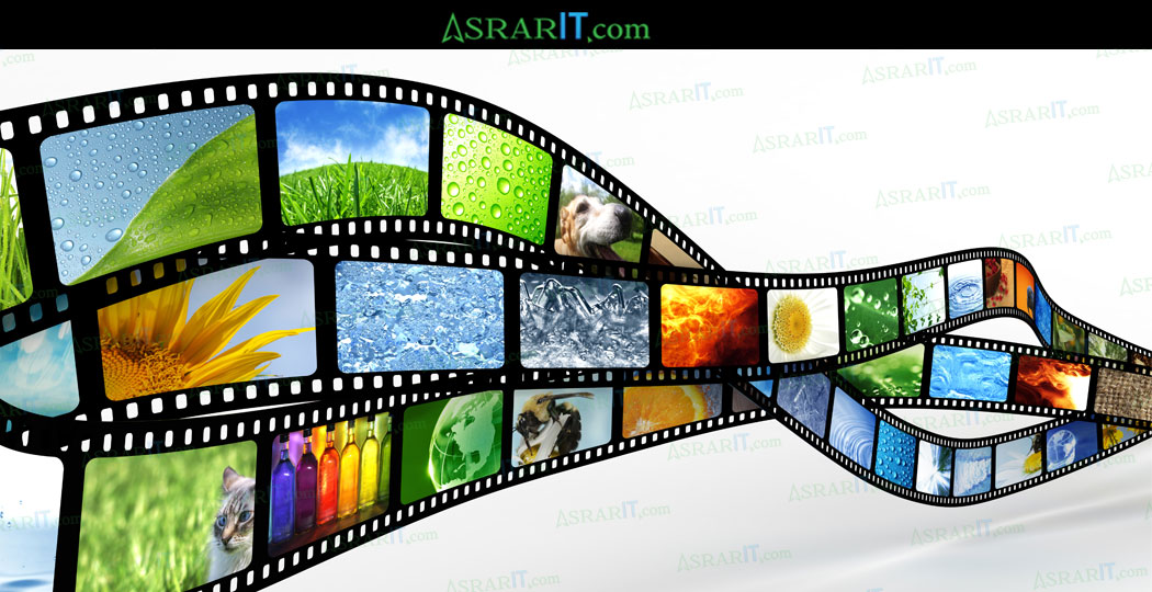
6) Use Images (But Use Them Wisely)
People across the Internet are getting smarter and faster at judging company websites. When they first visit your site they are easily able to pick out a generic stock photo that they have already seen elsewhere or that resembles the non-personal style of stock photography. Using stock photography can decrease trust and also stand out as generic and non-unique. Unfortunately these associations carry over to your business as well.
Ultimately,photography stock will be as capable of conveying YOUR brand, services, and products the way that you want to. Asrar Photography services can support your Brand Image. Use images strategically and place them in your website to support the content and allow the users a visual break from text, but make sure they are relevant and non-generic.
7) Include Well-Designed and Written Headings
Your headings and content should be driven by what your potential customers are looking for. Including keywords in your title is also very important for targeting your message and attracting the right audience.
Search Engines typically give headings more weight over other content, so choosing the right heading and making it stand out can significantly improve your search ability. But more importantly, headings guide your user through the site, making it easy to scan through and find content that speaks to them directly.
8) Keep Your Website Consistent
Consistency means making everything match. Heading sizes, font choices, coloring, button styles, spacing, design elements, illustration styles, photo choices, etc. Everything should be themed to make your design coherent between pages and on the same page. In order to provide your user with a beautiful experience as they navigate through your site, it is important that they know they are still in your website. Drastic design changes from one page to the other can lead your user to feel lost and confused and to lose trust in your site.
9) Be Responsive & Mobile-Friendly
Our technologies have advanced to meet our needs to be mobile. Websites are also a significant part of this evolution. It is imperative that your website is mobile-friendly and easy-to-navigate no matter the screen type through which it is being accessed.
Recently, Google started penalizing sites that aren't mobile optimized, making the need for responsiveness even more crucial. This is probably the single most valuable way in which you can improve your website’s usability.
If you enjoy reading Asrar IT blogs, Please take a moment to leave a Review and Rating on our Google+ page.
Thanks for your Support!